Schedule Control Configuration

The Schedule Control allows users to insert a schedule into a GraphWorX64 2D display.
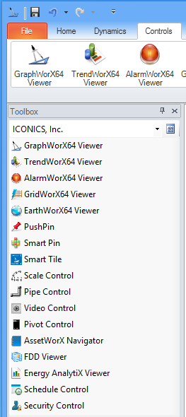
Selecting the Schedule Control from the Controls Ribbon in GraphWorX64

After you have created a new display in GraphWorX64, you can insert
a Schedule Control by selecting it from the Controls ribbon (as shown
above) or from the  Viewer
Menu of the Toolbox.
Viewer
Menu of the Toolbox.
Your cursor will turn into a '+', which allows you to set both the size of the control and its position within the display's canvas. The Schedule Control will then automatically size to the area you have created, as shown below.
A Newly Created Schedule Control in a GraphWorX64 Display Canvas
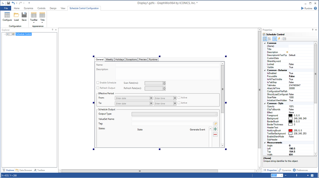
For info on how to set Schedule Control Pick properties from the right-side Properties section of the GraphWorX64 window, click HERE.
Note that the Schedule Control Configuration ribbon simultaneously appears at the top of the screen, as shown below.
Schedule Control Configuration Ribbon
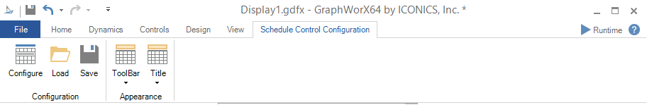
The ribbon's buttons are used only in a Schedule Control that has been added to the GraphWorX64 display. Each button on the ribbon, as well as the configurator that the ribbon opens, is described below.
-
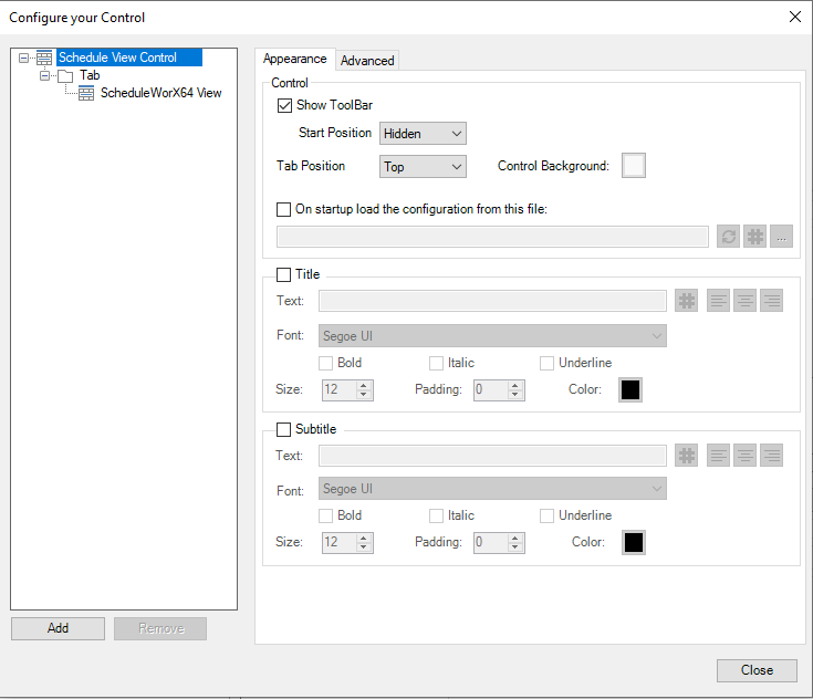
The Configure button within the Configuration section of the Schedule Control Configuration ribbon opens the 'Configure your Control' dialog box, where you can add schedule views. (The Save button allows you to save an in-progress configuration and the Load button allows you to retrieve saved configurations.)
In the configurator, you can add tabs to the control, and schedule views to each tab. This configuration dialog in the GraphWorX64 display configuration has the following components:
-
For the Control:
-
The
Appearance
tab lets you configure the control's overall appearance. -
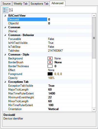
The
Advanced
tab gives you access to the control's properties.
Helpful tool tips that appear on the tab describe selected properties.
Configure your Control Dialog Box - Appearance Tab
You can right-click on the 'Schedule View Control' item in the 'Configure your Control' dialog to add new Tabs - or you can select the 'Schedule View Control' and click on the 'Add' button in the bottom left.
-
For each Tab:
-
The
Appearance
tab lets you configure the tab's appearance. -
The
Advanced
tab gives you access to the tab's properties.
Helpful tool tips that appear on the tab describe selected properties.
Configuring Your Tab Settings
You can right-click on a Tab in the left-side navigation pane in the 'Configure your Control' dialog to add:
-
a new ScheduleWorX View, or
-
a new BACnet Schedule View, or
-
a new BACnet Calendar View, or
-
a new BACnet Calendar View with SC, or
-
a new N1 Schedule View.
There are two separate schedule and calendar controls for BACnet: “Classic” vs. "with SC".
The SC controls use the new BACnet SC Point Manager tag syntax to connect. You can browse for this tag to connect to the schedule or calendar. The other features will generally work just like in the classic controls.
You must use the control that corresponds with the point manager that it is connecting to. So if you are connecting the display to BACnet classic, then use the classic schedule or calendar control, and vice versa.
Old displays will need to be manually updated to replace the classic control with the SC controls if you are moving the project to use the new Point Manager.
The image below shows a new ScheduleWorX View.
Configure your Control Dialog Box - View Settings
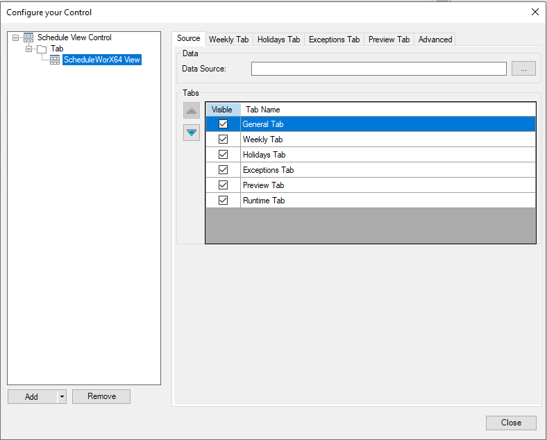
ScheduleWorX View
Each ScheduleWorX View contains the following tabs:
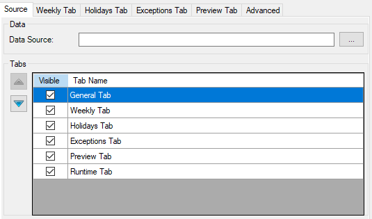
Source Tab
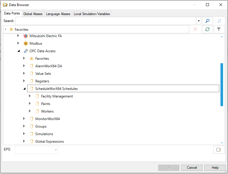
The 'Data' section of the Source Tab allows you to select a Data Source via the ellipsis button [...]. This opens the data browser, which allows you to navigate to your selected schedule data source, as shown below.
Browsing for Schedule Data
The Data Source field of the Source Tab allows you to set the hierarchy and visibility of the Tabs associated with the selected schedule data.
To search for a specific Data Source, click the ellipses to the right of the data source field.
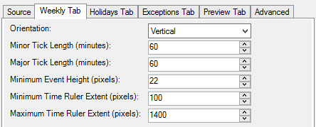
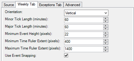
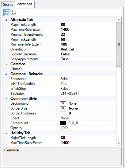
Weekly Tab
-
Orientation - Allows the user to select either a vertical or horizontal orientation.
-
Minor Tick Length (minutes) - Sets the length in minutes between minor tick marks for the Preview tab.
-
Major Tick Length (minutes) - Sets the length in minutes between major tick marks for the Preview tab.
-
Minimum Event Height (pixels) - Sets the minimum height of rows in the calender for horizontal orientation or month view.
-
Minimum Time Ruler Extent (pixels) - Sets the minimum size of the time ruler in pixels.
-
Maximum Time Ruler Extent (pixels) - Sets the maximum size of the time ruler in pixels.
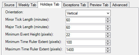
Holidays Tab
-
Orientation - Allows the user to select either a vertical or horizontal orientation.
-
Minor Tick Length (minutes) - Sets the length in minutes between minor tick marks for the Preview tab.
-
Major Tick Length (minutes) - Sets the length in minutes between major tick marks for the Preview tab.
-
Minimum Event Height (pixels) - Sets the minimum height of rows in the calender for horizontal orientation or month view.
-
Minimum Time Ruler Extent (pixels) - Sets the minimum size of the time ruler in pixels.
-
Maximum Time Ruler Extent (pixels) - Sets the maximum size of the time ruler in pixels.
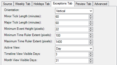
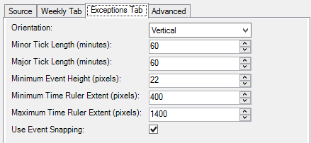
Exceptions Tab
-
Orientation - Allows the user to select either a vertical or horizontal orientation.
-
Minor Tick Length (minutes) - Sets the length in minutes between minor tick marks for the Preview tab.
-
Major Tick Length (minutes) - Sets the length in minutes between major tick marks for the Preview tab.
-
Minimum Event Height (pixels) - Sets the minimum height of rows in the calender for horizontal orientation or month view.
-
Minimum Time Ruler Extent (pixels) - Sets the minimum size of the time ruler in pixels.
-
Maximum Time Ruler Extent (pixels) - Sets the maximum size of the time ruler in pixels.
-
Active View - The index of the active view in the Exceptions Tab. Can be either Day, Week, Month or Timeline.
-
Timeline View Visible Days - Sets the number of days visible in the timeline view.
-
Month View Visible Days - Sets the number of days visible in the monthly view.
-
Use Event Snapping - Set to false to have precise control when dragging an event.
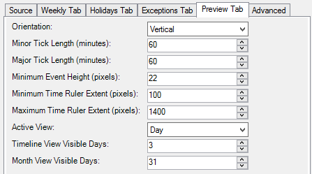
Preview Tab
-
Orientation - Allows the user to select either a vertical or horizontal orientation.
-
Minor Tick Length (minutes) - Sets the length in minutes between minor tick marks for the Preview tab.
-
Major Tick Length (minutes) - Sets the length in minutes between major tick marks for the Preview tab.
-
Minimum Event Height (pixels) - Sets the minimum height of rows in the calender for horizontal orientation or month view.
-
Minimum Time Ruler Extent (pixels) - Sets the minimum size of the time ruler in pixels.
-
Maximum Time Ruler Extent (pixels) - Sets the maximum size of the time ruler in pixels.
-
Active View - The index of the active view in the Exceptions Tab. Can be either Day, Week, Month or Timeline.
-
Timeline View Visible Days - Sets the number of days visible in the timeline view.
-
Month View Visible Days - Sets the number of days visible in the monthly view.
Advanced Tab
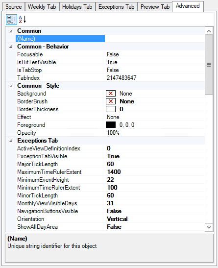
Expand
Here for Advanced Tab Parameter Descriptions.
BACnet Schedule View
Each BACnet Schedule View contains the following tabs:
Source Tab
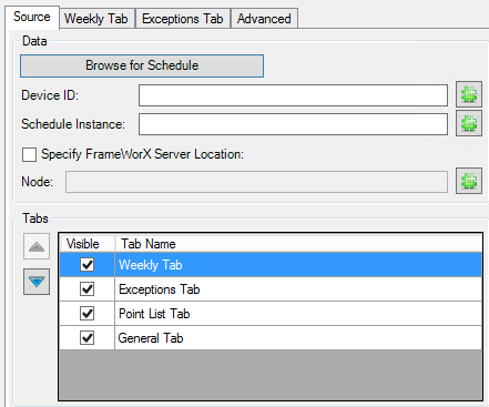
The 'Data'
section of the Source Tab allows you to click the Browse
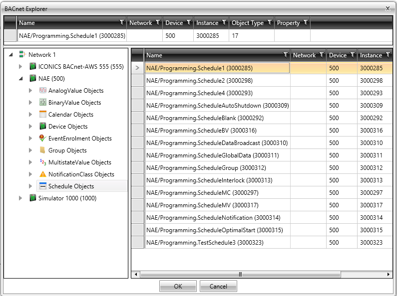
for Schedule button, which opens the BACnet Explorer,
allowing you to find a schedule via connected BACnet devices.
You can also select a data source by entering the desired BACnet device's Device ID and Schedule Instance (or using the '#' buttons to navigate to those elements).
Click on the Specify FrameWorX Server Location checkbox if you wish to a connect to a remote FrameWorX Server (if you don't want to connect to the default one). This activates the Node text entry field where you can type the location or you can use the '#' button to navigate to your desired location.
The 'Tabs' section of the Source Tab allows you to set the hierarchy and visibility of the Tabs associated with the selected schedule data.
Weekly Tab
-
Orientation - Allows the user to select either a vertical or horizontal orientation.
-
Minor Tick Length (minutes) - Sets the length in minutes between minor tick marks for the Preview tab.
-
Major Tick Length (minutes) - Sets the length in minutes between major tick marks for the Preview tab.
-
Minimum Event Height (pixels) - Sets the minimum height of rows in the calender for horizontal orientation or month view.
-
Minimum Time Ruler Extent (pixels) - Sets the minimum size of the time ruler in pixels.
-
Maximum Time Ruler Extent (pixels) - Sets the maximum size of the time ruler in pixels.
-
Use Event Snapping - Set to false to have precise control when dragging an event.
Exceptions Tab
-
Orientation - Allows the user to select either a vertical or horizontal orientation.
-
Minor Tick Length (minutes) - Sets the length in minutes between minor tick marks for the Preview tab.
-
Major Tick Length (minutes) - Sets the length in minutes between major tick marks for the Preview tab.
-
Minimum Event Height (pixels) - Sets the minimum height of rows in the calender for horizontal orientation or month view.
-
Minimum Time Ruler Extent (pixels) - Sets the minimum size of the time ruler in pixels.
-
Maximum Time Ruler Extent (pixels) - Sets the maximum size of the time ruler in pixels.
-
Use Event Snapping - Set to false to have precise control when dragging an event.
Advanced Tab
Expand
here for Advanced Tab Parameter Descriptions.
BACnet Schedule View with SC
The BACnet with SC Schedule view supports using an asset tag as the data source.
The data source for the SC Schedule view could be a static BACnet tag, such as:
-
Data Source:bac:Default Channel\DEV 1\SCHED 0
Alternatively you could use an asset tag, which will resolve to the proper underlying BACnet tag. In each of the following cases you must set "ExcludePathQuotes" = True, under the Advanced settings for the schedule control. -
Data Source: asset property (ex. ac:sched0.RealtimePointName) -> BACnet tag (ex. bac:Default Channel\DEV 1\SCHED 0)
-
Data Source: GAS (ex. <#myalias#>) -> asset property (ex. ac:sched0.RealtimePointName) -> BACnet tag (ex. bac:Default Channel\DEV 1\SCHED 0)
-
Data Source: GAS (ex. <#myalias#>) -> BACnet tag (ex. bac:Default Channel\DEV 1\SCHED 0)
Each BACnet Schedule View with SC contains the following tabs:
Source Tab
The 'Data'
section of the Source Tab allows you to click the Browse
for Schedule button, which opens the BACnet Explorer,
allowing you to find a schedule via connected BACnet devices.
You can also select a data source by entering the desired BACnet device's Device ID and Schedule Instance (or using the '#' buttons to navigate to those elements).
Click on the Specify FrameWorX Server Location checkbox if you wish to a connect to a remote FrameWorX Server (if you don't want to connect to the default one). This activates the Node text entry field where you can type the location or you can use the '#' button to navigate to your desired location.
The 'Tabs' section of the Source Tab allows you to set the hierarchy and visibility of the Tabs associated with the selected schedule data.
Weekly Tab
-
Orientation - Allows the user to select either a vertical or horizontal orientation.
-
Minor Tick Length (minutes) - Sets the length in minutes between minor tick marks for the Preview tab.
-
Major Tick Length (minutes) - Sets the length in minutes between major tick marks for the Preview tab.
-
Minimum Event Height (pixels) - Sets the minimum height of rows in the calender for horizontal orientation or month view.
-
Minimum Time Ruler Extent (pixels) - Sets the minimum size of the time ruler in pixels.
-
Maximum Time Ruler Extent (pixels) - Sets the maximum size of the time ruler in pixels.
-
Use Event Snapping - Set to false to have precise control when dragging an event.
Exceptions Tab
-
Orientation - Allows the user to select either a vertical or horizontal orientation.
-
Minor Tick Length (minutes) - Sets the length in minutes between minor tick marks for the Preview tab.
-
Major Tick Length (minutes) - Sets the length in minutes between major tick marks for the Preview tab.
-
Minimum Event Height (pixels) - Sets the minimum height of rows in the calender for horizontal orientation or month view.
-
Minimum Time Ruler Extent (pixels) - Sets the minimum size of the time ruler in pixels.
-
Maximum Time Ruler Extent (pixels) - Sets the maximum size of the time ruler in pixels.
-
Use Event Snapping - Set to false to have precise control when dragging an event.
Advanced Tab
Expand
here for Advanced Tab Parameter Descriptions.
BACnet Calendar View
Each BACnet Calendar View contains the following tabs:
Source
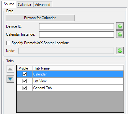
The 'Data'
section of the Source Tab allows you to click the Browse
for Calendar button, which opens the BACnet Explorer,
allowing you to find a calendar via connected BACnet devices.
You can also select a data source by entering the desired BACnet device's Device ID and Calendar Instance (or using the '#' buttons to navigate to those elements).
Click on the Specify FrameWorX Server Location checkbox if you wish to a connect to a remote FrameWorX Server (if you don't want to connect to the default one). This activates the Node text entry field where you can type the location or you can use the '#' button to navigate to your desired location.
The 'Tabs' section of the Source Tab allows you to set the hierarchy and visibility of the Tabs associated with the selected schedule data.
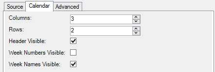
Calendar Tab
-
Columns - The number of columns to show in the calendar. The product of rows times columns must be twelve or less.
-
Rows - The number of rows to show in the calendar. The product of rows times columns must be twelve or less.
-
Header Visible - Click the checkbox to show the calendar's navigation header.
-
Week Numbers Visible - Click the checkbox to show week numbers in the calendar.
-
Week Names Visible - Click the checkbox to show week names in the calendar.
Advanced Tab
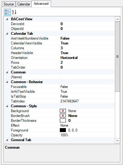
Expand here
for Advanced Tab Parameter Descriptions.
BACnet Calendar View with SC
The BACnet with SC Calendar view supports using an asset tag as the data source.
The data source for the SC Calendar view could be a static BACnet tag, such as:
- Data
Source: bac:Default Channel\DEV 1\CAL 0
Alternatively you could use an asset tag, which will resolve to the proper underlying BACnet tag. In each of the following cases you must set "ExcludePathQuotes" = True, under the Advanced settings for the calendar control. - Data Source: asset property (ex. ac:sched0.RealtimePointName) -> BACnet tag (ex. bac:Default Channel\DEV 1\CAL 0)
- Data Source: GAS (ex. <#myalias#>) -> asset property (ex. ac:sched0.RealtimePointName) -> BACnet tag (ex. bac:Default Channel\DEV 1\CAL 0)
- Data Source: GAS (ex. <#myalias#>) -> BACnet tag (ex. bac:Default Channel\DEV 1\CAL 0)
Each BACnet Calendar View with SC contains the following tabs:
Source
The 'Data'
section of the Source Tab allows you to click the Browse
for Calendar button, which opens the BACnet Explorer,
allowing you to find a calendar via connected BACnet devices.
You can also select a data source by entering the desired BACnet device's Device ID and Calendar Instance (or using the '#' buttons to navigate to those elements).
Click on the Specify FrameWorX Server Location checkbox if you wish to a connect to a remote FrameWorX Server (if you don't want to connect to the default one). This activates the Node text entry field where you can type the location or you can use the '#' button to navigate to your desired location.
The 'Tabs' section of the Source Tab allows you to set the hierarchy and visibility of the Tabs associated with the selected schedule data.
Calendar Tab
-
Columns - The number of columns to show in the calendar. The product of rows times columns must be twelve or less.
-
Rows - The number of rows to show in the calendar. The product of rows times columns must be twelve or less.
-
Header Visible - Click the checkbox to show the calendar's navigation header.
-
Week Numbers Visible - Click the checkbox to show week numbers in the calendar.
-
Week Names Visible - Click the checkbox to show week names in the calendar.
Advanced Tab
Expand here
for Advanced Tab Parameter Descriptions.
N1 Schedule View
Each N1 Schedule View contains the following tabs:
Source
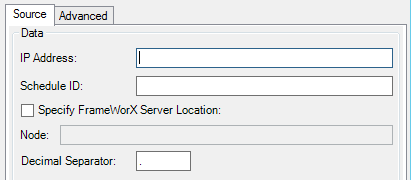
-
IP Address - Enter the IP address of the N1 Schedule data source.
-
Schedule ID - Enter the Schedule ID for the N1 Schedule data source.
-
Specify FrameWorX Server Location - Click this checkbox if you wish to provide the FrameWorX Server Location.
-
Node - If you opted to 'Specify FrameWorX Server Location', you can enter the location node in the text entry field.
-
Decimal Separator - You can edit the decimal separator (from the default period [.] in the text entry field.
Advanced
Expand Here
for Advanced Tab Parameter Descriptions.
Remaining Schedule Control Configuration Ribbon Options
-
Configuration - Load - The Load button within the Configuration section of the Schedule Control Configuration ribbon loads a saved schedule control configuration (.schx) file. Clicking this button brings up a Warning box asking if you are sure that you want to load a new configuration file for the Schedule Control and that the current configuration will be lost. Click on 'Yes' to proceed or 'No' to cancel.
Load Button
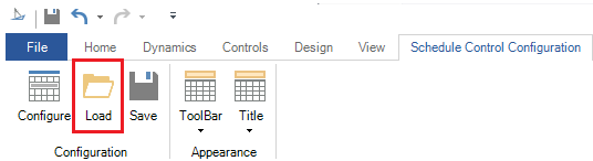
-
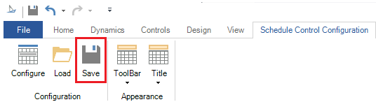
Configuration - Save - The Save button within the Configuration section of the Schedule Control Configuration ribbon saves the current schedule control configuration file in .schx format.
Save Button
-
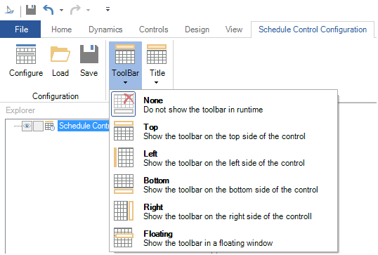
Appearance - ToolBar - The Toolbar button within the Appearance section of the Schedule Control Configuration ribbon modifies the visibility and the position of the toolbar. Options include None, Top, Left, Bottom, Right or Floating.
ToolBar Options
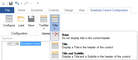
-
Appearance - Title - The Toolbar button within the Appearance section of the Schedule Control Configuration ribbon modifies the visibility of the title and subtitle. Options include None, Title or Title and Subtitle.
Title Options